Online mentoring platform, where you can get mentorship according to your schedule.
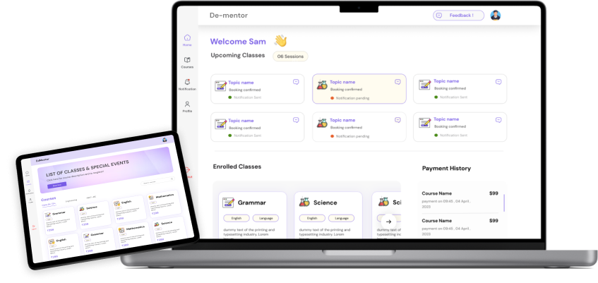
DE-mentor is an innovative mentoring application designed to facilitate meaningful connections between students seeking guidance and professionals eager to share their expertise. Rooted in a deep understanding of user needs and preferences, where mentors offers flexible scheduling time that enables users to coordinate mentoring sessions at their convenience. Integrated calendar functionalities and automated reminders streamline the scheduling process, ensuring seamless communication and collaboration between mentors and mentees.
Students face problems when seeking personalized career guidance and mentorship. Many individuals need help finding suitable mentors. They often need more resources and connections to connect with experienced mentors who can help them navigate on the right path
The solution is DE-mentor app that connects students with experienced mentors. The app leverages advanced matching algorithms to pair mentees with mentors who possess the relevant skills, knowledge, and expertise. It offers a platform for meaningful one-on-one mentoring sessions, and networking opportunities.
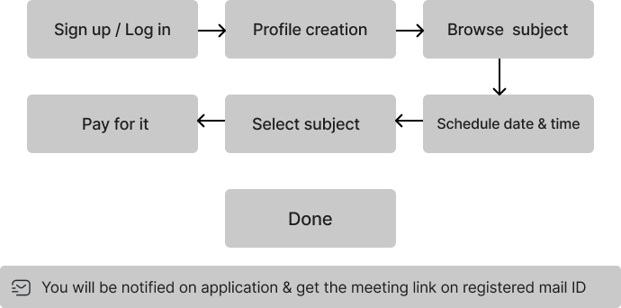
Our first step was to define the primary user archetype for our mentoring application. We aimed to cater to students aged 15-25 seeking mentorship in various academic and professional domains. Additionally, we identified potential mentors as professionals with at least five years of industry experience willing to provide guidance and support to mentees. To gain insights into the current state of user experience (UX) and user interface (UI) design, we conducted usability tests with individuals who fit our user archetype.
During the ideation phase, my primary objective was to conceptualize a mentorship platform that would effectively connect students with mentors in a personalized and impactful manner. i kicked off this phase by immersing ourselves in extensive user research, engaging with both potential mentees and mentors to understand their pain points, aspirations, and expectations regarding mentorship. Through surveys, and feedback sessions, i gained valuable insights into the challenges faced by students seeking guidance and professionals interested in offering their expertise.
The design process began with the creation of low-fidelity wireframes, which served as the blueprint for the platform's layout and navigation. Iterating through multiple iterations, I refined the wireframes to ensure optimal usability and clarity of information hierarchy. Through close collaboration with stakeholders, I aligned on the overall structure of the platform, laying the groundwork for the subsequent visual design phase.the design phase was characterized by a harmonious blend of creativity, functionality, and user-centricity, culminating in the development of a visually stunning and intuitively navigable interface that embodies the ethos of the mentorship platform.
Moving into the prototype phase, I translated the finalized designs into interactive prototypes, simulating the user experience and functionality of the mentorship platform. Leveraging prototyping tools like Figma, I meticulously crafted clickable prototypes that allowed stakeholders to navigate through key workflows and interactions, providing a tangible representation of the platform's features and capabilities. With the prototypes in hand, I conducted usability testing sessions with a diverse group of users, including students and professionals who would be engaging with the platform.
Conducted usability testing sessions with representative users to evaluate the prototypes and gather feedback on their usability, functionality, and overall user experience. Observe users as they interact with the prototypes, asking them to perform specific tasks and tasks to identify any usability issues or pain points. Analyze the feedback and insights gathered during testing to iteratively refine and improve the prototypes, making adjustments based on user feedback and design principles.